


Uporabniška navodila
USER INSTRUCTIONS (pdf)
The SLORA program allows independent preparation and presentation of data on the incidence, mortality, prevalence and survival of cancer patients in Slovenia. Data can be prepared by moving through search windows - for each epidemiological indicator a separate search window is available. The use of all windows is identical; the windows differ only in content – depending on the type of epidemiological indicator a variety of parameters can be defined for exact data preparation and presentation. Further on, this guide describes the parameters in the search window incidence measures - incidence.
Descriptions and definitions of epidemiological indicators and parameters are collected in the Glossary and are available also while using the program by clicking the word in search window.
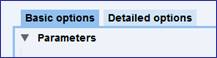
Defining data for output
Window for data definition has three sections:
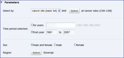
In the upper sectionyou can choose the parameter for the data output. For example, if you want data for different cancer sites, then choose output by cancer site in upper section, but if you want data to be shown by sex, then choose output by sex.

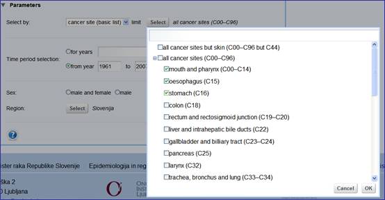
The program enables limitations of number of chosen categories. Defining output by sex you can limit output for only one sex by marking the button in front of sex chosen. When you choose parameter with many categories (cancer site or regions), limit the number of categories in special window, which can be shown with the button Choose. In this new window mark the chosen categories with a check mark. Categories can be unmarked again with another click on the check mark. Confirm the chosen categories by clicking the button OK.
In the middle sectionyou can define the time interval. At button for years write in the field one year, more years or time interval, for which you want the data. By choosing the button from the year included till you define time interval and data will be shown for each individual year within this interval (time trend).
Lower sectionallows the limitations of output. You can define output by individual sex, region or cancer site; in Detailed options you can define it also by stage and 5-years age groups. By default you can get outputs without limitations (both sexes and region Slovenia). Parameter chosen in the upper section is not available in the lower section. If upper section contains output by cancer site, data output for both sexes and for the whole Slovenia in the tab Basic options can be chosen in the lower section (in this case keep the default selections) or you can choose data output for specific sex or region. For category definition, the same tools as with limitations in upper section are available (i.e. for parameters with fewer categories you use buttons, for parameters with many categories you use additional window, where check marks are used for selection).

Data preparation is activated with the button Execute.

Adjustment of data for output
The program stores your last choice. Window Parameters can be shown again by clicking the arrow. At this point you can adjust your first choice in search scheme.

Outputs forms
Data are shown in graphic and in tabular form.
Graphical output
The shape of graph depends on output form defined in upper section of search window and on the time interval defined in middle section of search window:
Pie chartis drawn for data output by individual year or by time interval when you choose output by sex in Basic options and when you choose output by stage in Detailed options.
Horizontal bar chartis drawn for data output by individual year or by time interval when you choose output by cancer sites, by 5-years age groups (only in Detailed options) and by administrative units/regions when you do not define units in whole country Slovenia.
Mapis drawn for data output by individual year or by time interval when you choose output by regions or administrative units for the whole country Slovenia. Regions/administrative units on the map are divided in 5 different color sections based on the relative scale (in first, dark blue section there are 20 % of units with lowest cancer burden, in the last, red section there are 20% of units with highest cancer burden, the rest sections are less intensive colored and represent each 20 % of units). Graphic output for regions on maps can not be done if the output contains less than 150 cases and can not be done for administrative units unless there are at least 600 cases.
Line chartshows the time trend. Graphic output of the time trend can not be done if you choose more than 12 categories.
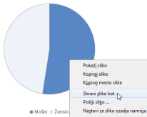
Graphs saving
Export prepared graph and save it on your computer as picture. With right mouse button Save picture as appears, click it to save the picture as png format.
Tabular output
Below the graph is the table with data, from which the graph derives, is always included. Table is shown in any case, even if you choose too many categories for the graph to be outlined or too few units for the map to be drawn.
Processing and saving tables
Clicking the Excel for Windows icon above the table, you can open the same table in your own table browser, where you can change or save it.
